Article: Providence: The Meaning Behind the Mark
Providence: The Meaning Behind the Mark
The story behind the crest on the Providence Hoodie.
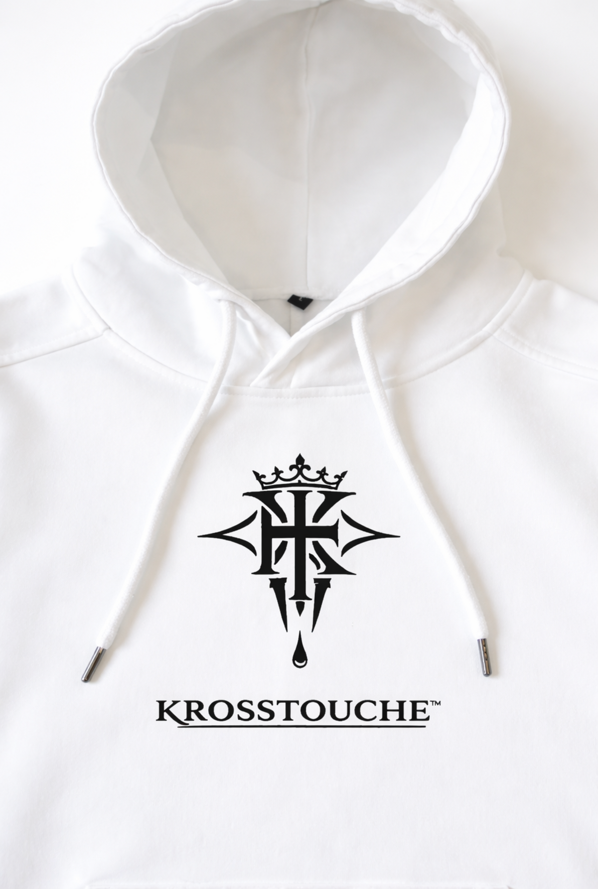
Some details are designed to be noticed immediately. Others are designed to reveal themselves over time. The crest on the KROSSTOUCHE® Providence Hoodie — Optic White was built to be the second.
I've always believed symbols matter — not because a logo can make a garment valuable, but because a meaningful one can remind you who you're trying to become. That's what this crest represents. It wasn't created to make Providence look luxurious. It was created to mean something.
The Story Behind the Mark
When I started KROSSTOUCHE®, I wanted the clothing to represent more than appearance. The idea came from something personal — the belief that struggle, faith, discipline and perseverance can be carried with dignity rather than hidden in shame. Life places weight on all of us. Some of it is visible. Some isn't. But what we carry shapes who we become.
The crest brings together three ideas: the Cross, the Touch, the Crown.
The Cross is the foundation — burden, sacrifice, the weight everyone carries in some form. It doesn't pretend life is easy. It's a reminder that difficulty doesn't have to define you; sometimes it's part of what strengthens you.
The Touch is the name's origin — the belief that our greatest burdens and our greatest breakthroughs are sometimes separated by a single moment of contact: a conversation, a decision, a second chance. It's the space between what you've carried and what you're becoming.
The Crown sits at the top, and it isn't about status or power. It's what's earned — the result of endurance, responsibility, growth, discipline. You don't receive a crown. You become worthy of carrying it.
The name Providence carries the same idea forward: that there can be purpose within the journey, even before the destination is visible. You carry what's in front of you, you trust the process, and eventually you look back and see that the moments you questioned were shaping who you became.
That's why "Carry the Cross. Trust the Touch. Earn the Crown" is more than a slogan — it's the philosophy the crest was built on.
Why It Belongs on Providence
Providence was designed with restraint. The clean Optic White colourway gives the construction and the crest room to speak without distraction. The crest sits across the chest — not oversized, not surrounded by extra graphics, not competing with the person wearing it. That's deliberate: Providence doesn't need heavy branding to establish identity. Its 480 GSM construction gives it physical presence; the clean silhouette gives it structure; the crest gives that structure meaning.
I've never believed luxury is measured by how loudly a brand speaks. It can live in the weight of the fabric, the precision of the stitching, the confidence to leave unnecessary things behind. The crest follows the same rule — it doesn't need to dominate the garment to matter. It just needs to belong. On Providence, it does.
A Mark Becomes Personal
As KROSSTOUCHE® grows, I know this crest will mean different things to different people. Someone may see resilience where I saw faith. Someone may see ambition where I saw endurance. All of those readings are welcome — a meaningful symbol shouldn't belong only to its creator. It can begin with my story. It doesn't have to end there.
Providence
480 GSM heavyweight construction. Optic White finish. Crest embroidery. Structured form. Considered restraint.
Nothing here is there simply because there was space for it. Providence is designed to be experienced, not explained.
Closing Reflection
A logo can identify a brand. A meaningful mark can remind you of something you refuse to forget. The crest on Providence was built to be the second.
The cross is what we carry. The touch is what changes us. The crown is what we earn. Providence is the belief that the journey itself has purpose.
Carry the Cross. Trust the Touch. Earn the Crown.

Written by AYODEJI ONADEKO